The day has come — we’ve finally let go of the green color palette. RIP, Wicked Witch of the West. You would’ve loved our old branding.
After months of strategizing, collaborating and creating one too many inspo boards on Pinterest, we’re officially launching our brand refresh — and it feels like the right time to say it out loud: we’ve grown, and so has our brand.
This rebrand isn’t a reinvention — it’s a progression. It’s who we’ve always been, but brighter, bolder and more in sync with how we serve our clients and present ourselves to the world.
Why Now?
In the words of our CEO, John Williams:
“We’re living in a post-AI world where businesses are either low-touch, low-authenticity – or the complete opposite: full-touch, high-value, human-led. We’re proud to be the latter.”
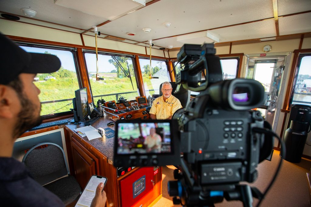
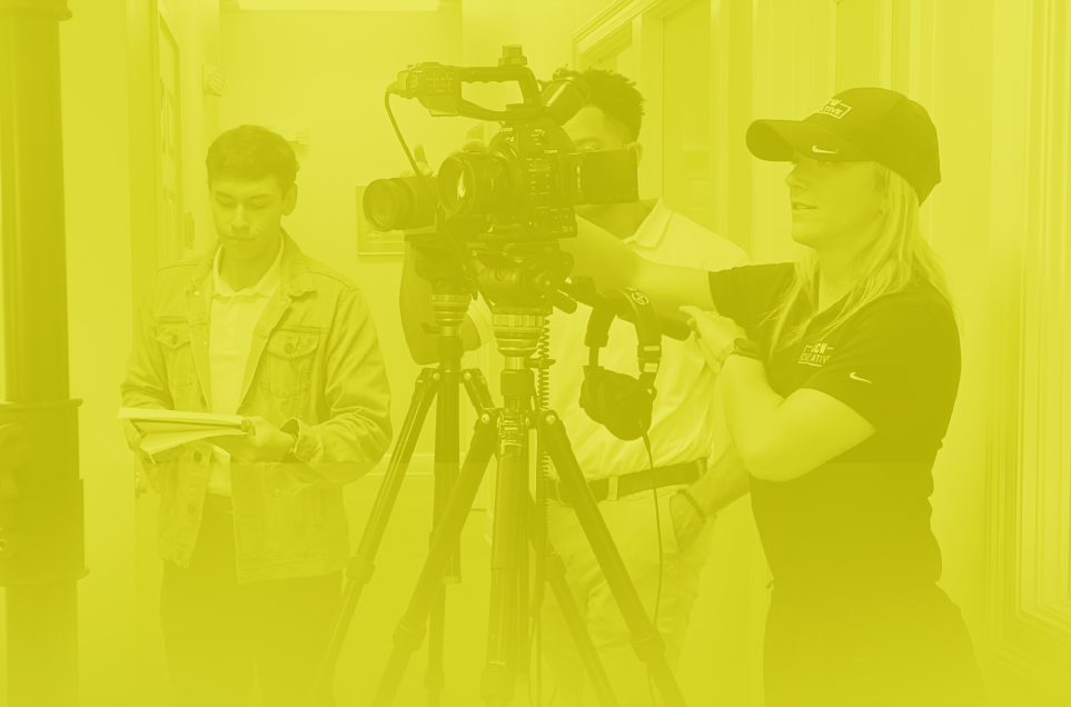
We’ve always worked closely with clients, helping them shape their brands, spark ideas and build something meaningful. Though we’ve shared a peek of that close collaboration process, we’ve remained mostly behind the scenes. Our new look brings our thinking to the forefront because when we show up fully as ourselves, it challenges our clients to do the same.
This refresh reflects years of momentum: evolving our messaging, visuals and voice to match the depth of what we do. And while our core hasn’t changed (hello, caring + growth mindset), the way we express it has.
Let’s Talk Design
Whitley, our Lead Graphic Designer, led the charge for our new visual direction, which started with color.
“We wanted something more vibrant, more energetic – something that visually captures the innovation and brainstorming that drives our work. The new palette reflects that. It’s fresh, dynamic and intentionally designed to feel personal.”
The color names say it all: Edison Black, Electric Blue, Circuit Green, Sky Blue and Incandescent White—each chosen to reflect spark, movement and purpose.
Our process icons also got a major upgrade. The lightning bolt now anchors the visual language across every stage of our process. It’s a nod to the creative current running through everything we do.
Our Voice Got Louder, Too
Sounding a little different to you? With the rebrand, we didn’t just change our look — we rewrote how we talk about ourselves.
“We wanted the JCW brand voice to reflect our personality,” says Lead Copywriter Madison. “It’s funny, collaborative and confident – without ever being cold or cocky. Because we’re serious about what we do, but we also believe in having fun doing it.”
Establishing a more authentic brand voice allows us to speak directly to the people we’re here to help in a style that’s unmistakably ours.
Behind the Site
Lead Web Designer Katie brought the whole thing to life digitally with a completely reimagined website experience.
“We wanted the site to feel modern and vibrant—but also real. So we focused on movement, color and showcasing the people behind the work. We added behind-the-scenes moments and made the whole thing feel more human.”
The result? A site that feels more like us: smart, fun, collaborative and full of energy.
What’s Next
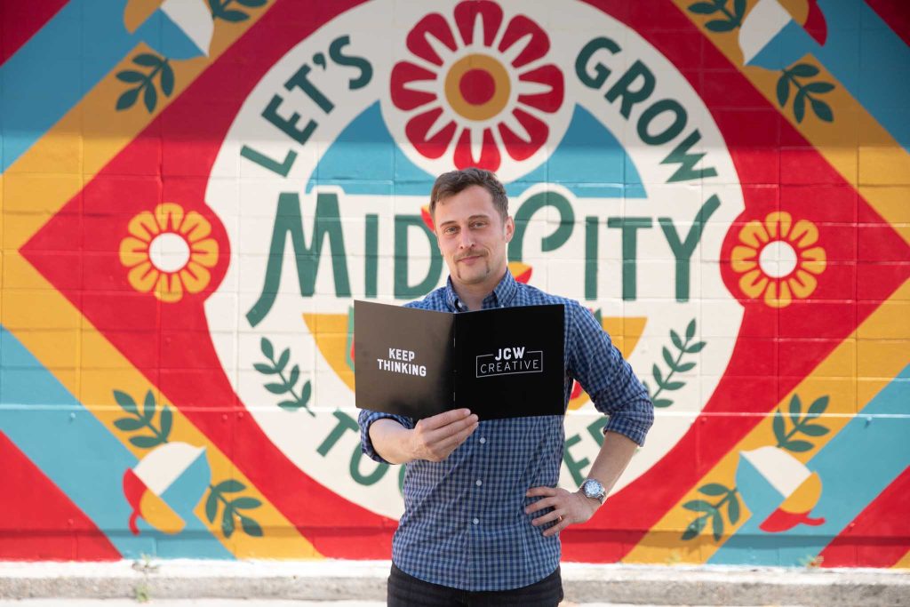
We hope this rebrand inspires clients, partners and our team to keep thinking bigger. This isn’t just a visual refresh. It’s a reflection of our growth.
“At our core, we’ve always been about care, creativity and showing up to take the next swing,” said John.
We’re still JCW Creative. We’re just showing more of what’s always been there. So explore the new site, soak in the new colors and most of all — keep thinking.